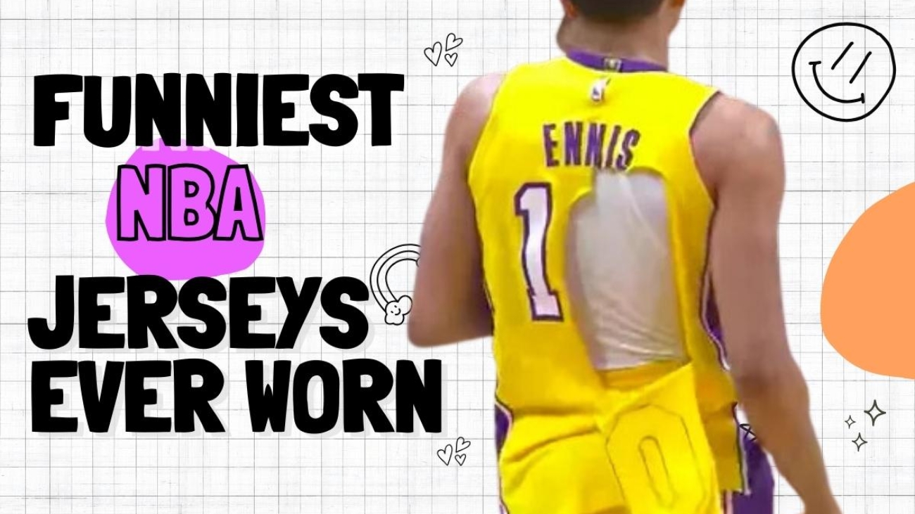
Which NBA jerseys have been the funniest ever seen on the court?
Starting off, we have the Philadelphia 76ers Road jersey.
Hold on to your laughter, folks, because this jersey looks like it was plucked straight out of an eight-year-old’s pajama drawer.
It’s a prime example of when the design takes a nosedive into the realm of terrible.
Watching players don them on the court was enough to have you yearning for the comfort of your own bed!
This fashion failure will leave you chuckling and questioning the stylistic choices of the NBA.
But wait until you hear about the next one: The Toronto Raptors Alternate.
Now, these bad boys are plain to the extreme. Granted, simplicity can be cool, right? Well, it would be if they didn’t choose a color scheme that screams “Barbie’s dream world”!
It’s like the Raptors took a trip to the pink aisle and got lost in a sea of frills and sparkle.
Up next, we have the Milwaukee Bucks Alternate.
You know what? I must admit, this jersey doesn’t make my blood boil as much as it does for some folks.
But let me tell you, I can totally see why people are in agony after staring at these things for a full two hours.
They’re just plain old boring green with a single picture slapped on, and even that picture isn’t all that impressive, to begin with.
Seriously, where’s the pizzazz? Where’s the excitement? We deserve better.
Moving ahead, let’s talk about the Vancouver Grizzlies.
This jersey looks like it was whipped up by someone who raided the Superman credits for inspiration.
I mean, seriously, those fonts are straight out of Clark Kent’s closet. And don’t even get me started on that bear.
Who in their right mind thought it was a good idea to plaster that thing on both sides? It’s just plain dumb! The whole design screams “accident” rather than a well-thought-out creation. Oh, and let’s not forget about that ghastly color.
Ugly doesn’t even begin to cover it. Stare at that eyesore for any length of time, and I guarantee you’ll question your sanity.
Now, let’s shift our focus to the Phoenix Suns Orange.
These jerseys are like a nightmare come true. Every time we saw the Suns rocking those horrors, it brought tears to our eyes.
I mean, seriously, who thought it was a stroke of genius to associate sunset with that shade of orange? It’s like a bad punchline to a joke.
But credit where it’s due; the only glimmer of hope in this whole mess is the name on the jersey.
Thank goodness they at least got that part right. It’s like a tiny beacon of light amid this design disaster.
Next up, let’s talk about the 1994 All-Star Game jersey.
I’ve got a Phoenix fact that’s as obvious as the sun in the sky. There are cacti in Phoenix! Shocking, I know.
But guess what? Instead of picking up a National Geographic magazine, we have this jersey as our personal Discovery Channel.
They decided to slap a cactus right smack in the middle of a star. And what does that make it?
You guessed it—an All-Star Game Jersey. Brilliant deduction, my friend. It’s like the designer was playing catch-up with a looming deadline and thought, “Hey, let’s just throw a cactus in there and call it a day.”
Let’s now shift our attention to the Houston Rockets Road jersey.
I thought the Philadelphia 76ers Road jerseys were the only pajamas, but now we have jerseys that take the cake.
Take a good look at those stripes. They’re done so poorly; it’s like someone was blindfolded and had their hands tied behind their back while attempting to draw them. And don’t even get me started on that so-called design. I’m scratching my head, trying to figure out what on earth it’s supposed to represent.
Alright, let’s break it down. We’ve got a rocket flying around a basketball, which apparently represents a planet. Uh-huh, sure thing.
I can’t help but wonder if the designer took a nap during their brainstorming session. I mean, it’s a great idea in theory, but execution matters, people! Next time, let’s put some actual thought into what we’re putting on our players, shall we? These jerseys need a serious makeover before they hit the court.
Let’s aim for style, coherence, and a design that doesn’t leave fans scratching their heads in confusion.
Now, let’s talk about the Chicago Red and Blue jerseys.
I’ve only managed to track down a single picture of these jerseys online, but trust me; it’s enough to confirm their existence.
And let me tell you; it’s not a pretty sight. A white belt right smack in the middle of the jersey. Yep, you heard that right.
They actually thought it would be a genius idea to add a belt to the mix. But let’s be honest here; that white belt just takes the whole catastrophe to a whole new level of awfulness.
Moving ahead, let’s take a look at the Bobcat’s NASCAR jerseys.
Even if you’re a NASCAR fan, these jerseys will surely put your excitement level in neutral. I mean, just take one glance at them, and you can practically hear the crickets chirping. They’re that boring.
And hey, they might as well have called them NASHCAR jerseys during that game, right? A little play on words to lighten the mood.
But let’s face it, even that pun couldn’t salvage the situation. It’s time to hit the brakes and move on to something more visually distressing.
Now, let’s not forget the Sacramento Kings Alternate jersey.
Gold jerseys are just not the best. And you know why? Because quite frankly, no team has successfully pulled off the gold look.
Time and time again, we’ve witnessed multiple teams taking a swing at the gold jersey trend, and sadly, they’ve all ended up swinging and missing. It’s like a curse that haunts the realm of sports fashion.
In a similar vein, let’s discuss the Washington Wizards Alternate jersey.
So, the gold fever strikes again, and it’s not pretty.
Just like I’ve said before, gold jerseys tend to be an eyesore, and this one is no exception. I mean, seriously, what were they thinking?
And wouldn’t you know it, here we are with yet another team joining the list of gold jersey failures?
It’s high time teams realized that gold doesn’t automatically equal glory in the jersey department.
We need fresh ideas, unique designs, and colors that truly make a statement.
And the grand finale goes to the Denver Nuggets.
If you’re up for a taste of the rainbow, this jersey is just for you. They’re so hilariously out there that just looking at them will crack you up. And, oh boy, don’t even get me started on the creative process behind them.
Did someone actually sit down and think, “Hey, you know what could be a hit? Rainbow jerseys!
Yeah, let’s dress our team up in a vibrant spectrum of colors and watch the crowd go wild!”
It’s almost too comical to fathom.
Now, would you wear any of these NBA jerseys in public, or are they best left for the basketball court?
Leave A Comment